
BRANDING ILLUSTRATION PACKAGING
surly’s
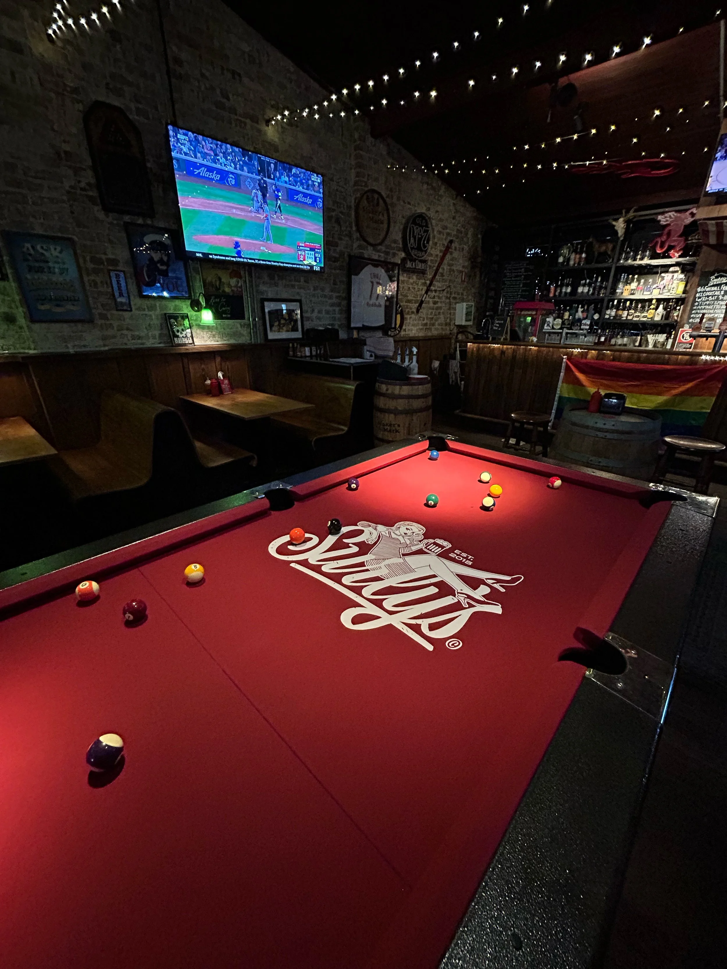
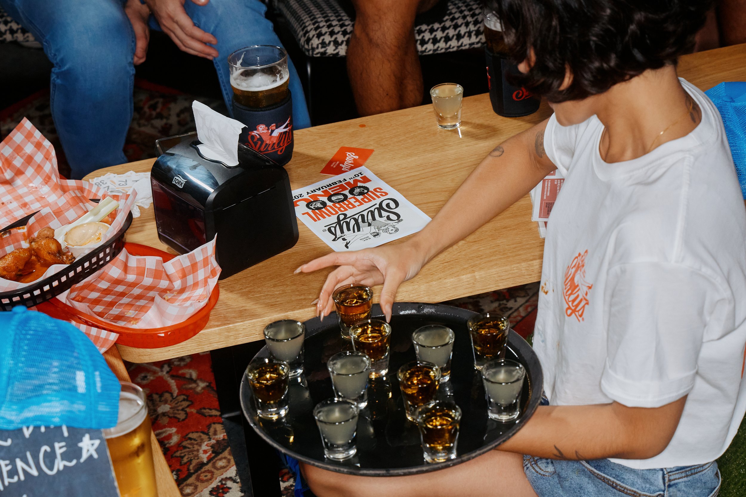
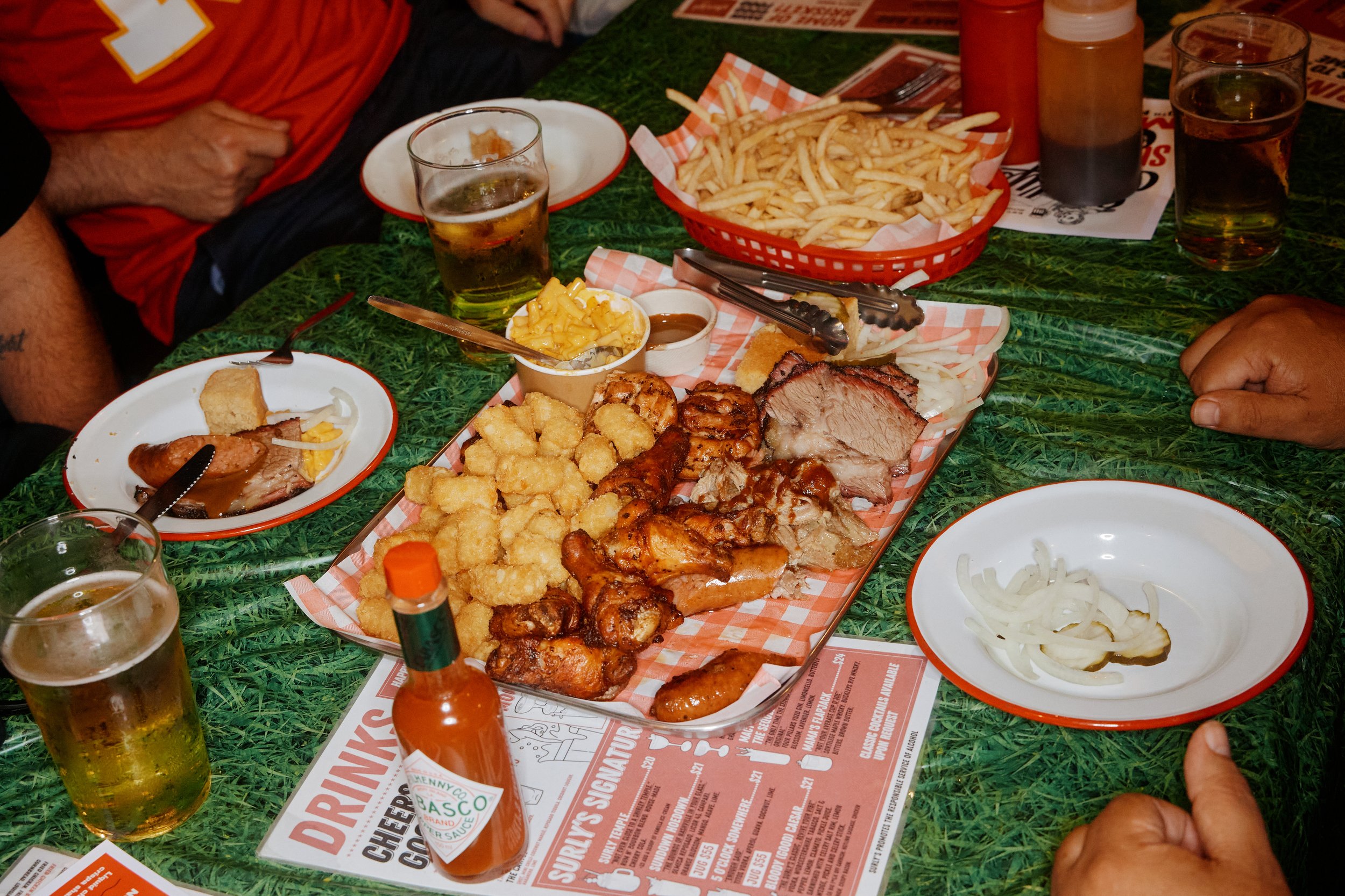
Surly’s was voted the #1 best dive bar and BBQ restaurant in Sydney and to celebrate we worked together on a full rebrand and redirection of their customer experience.
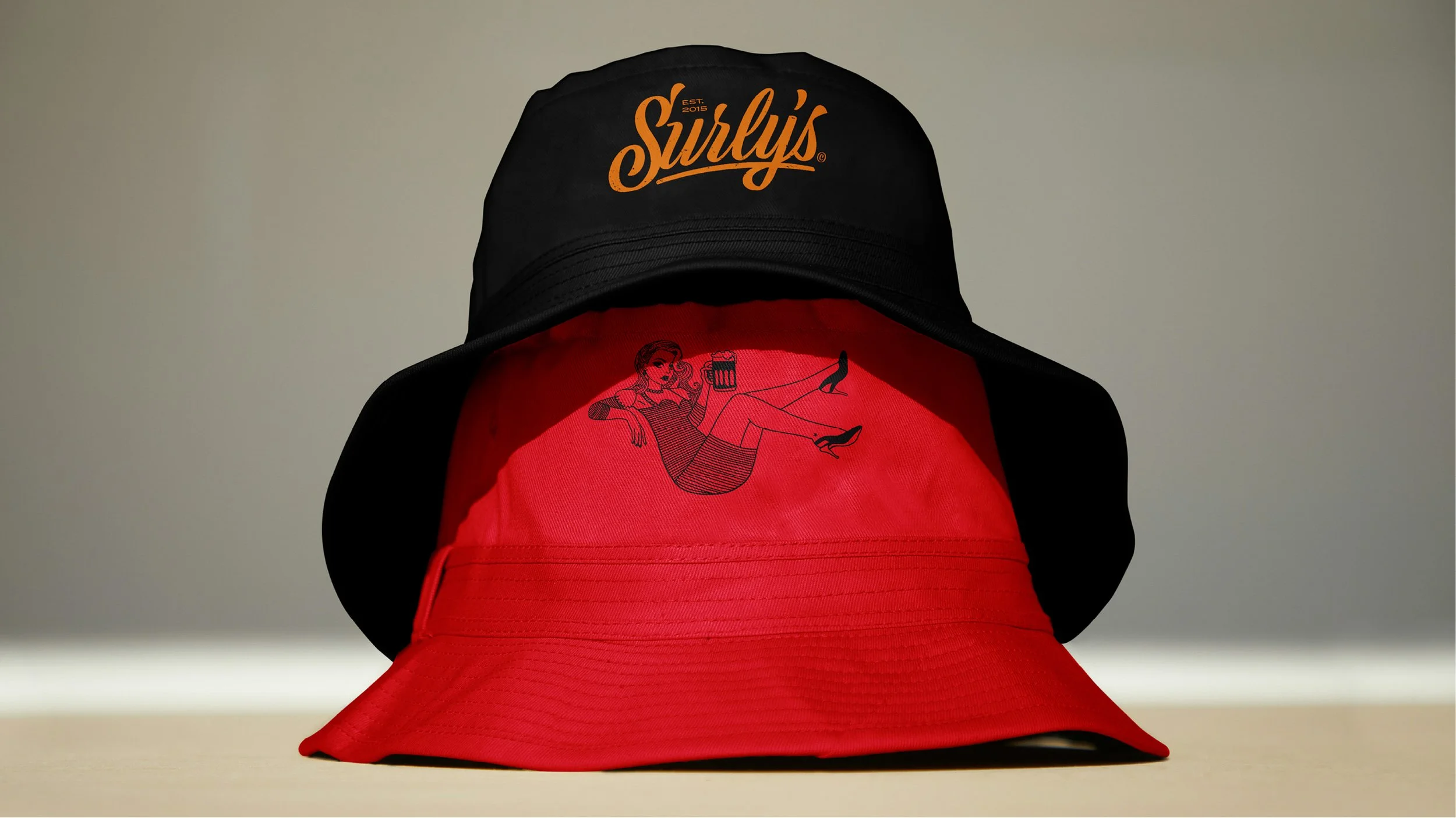
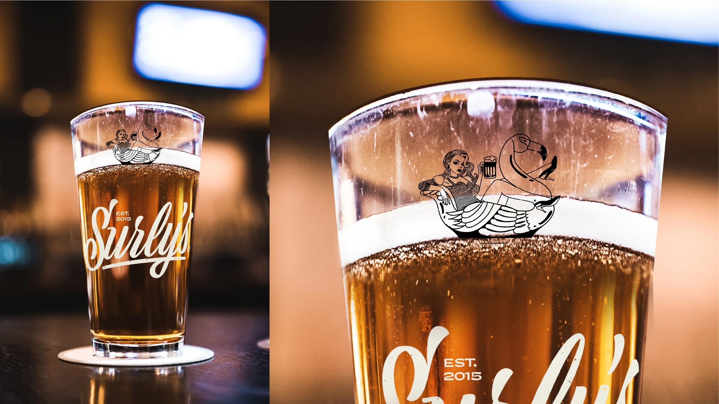
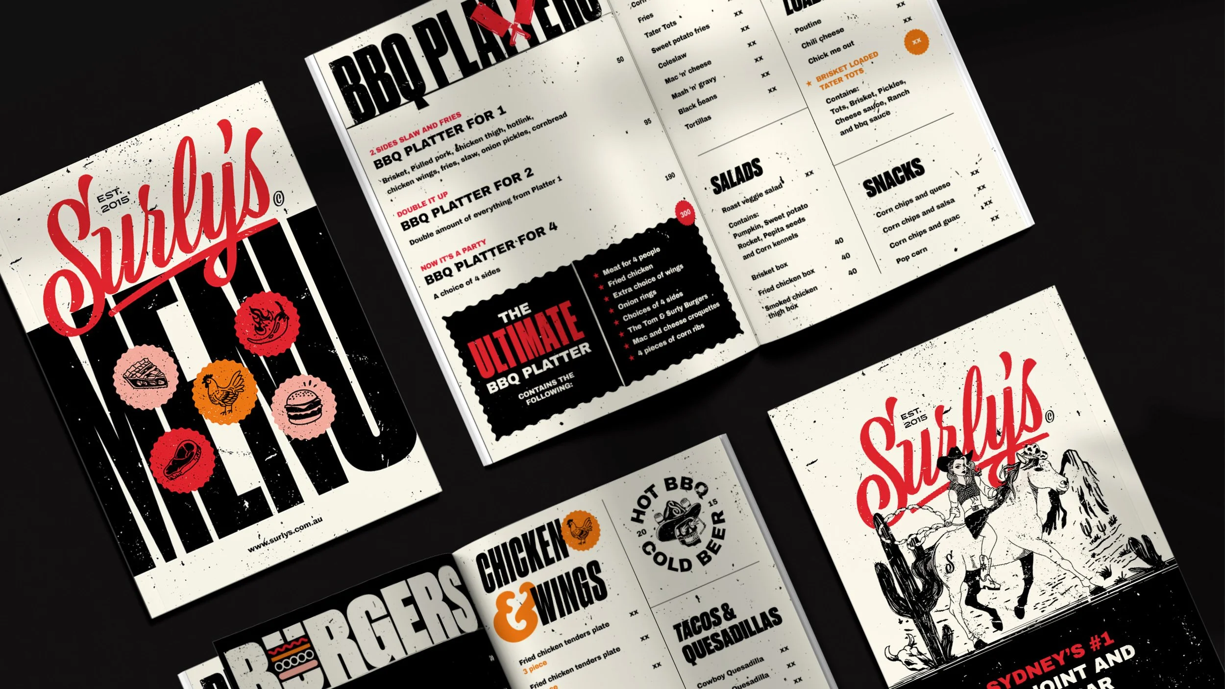
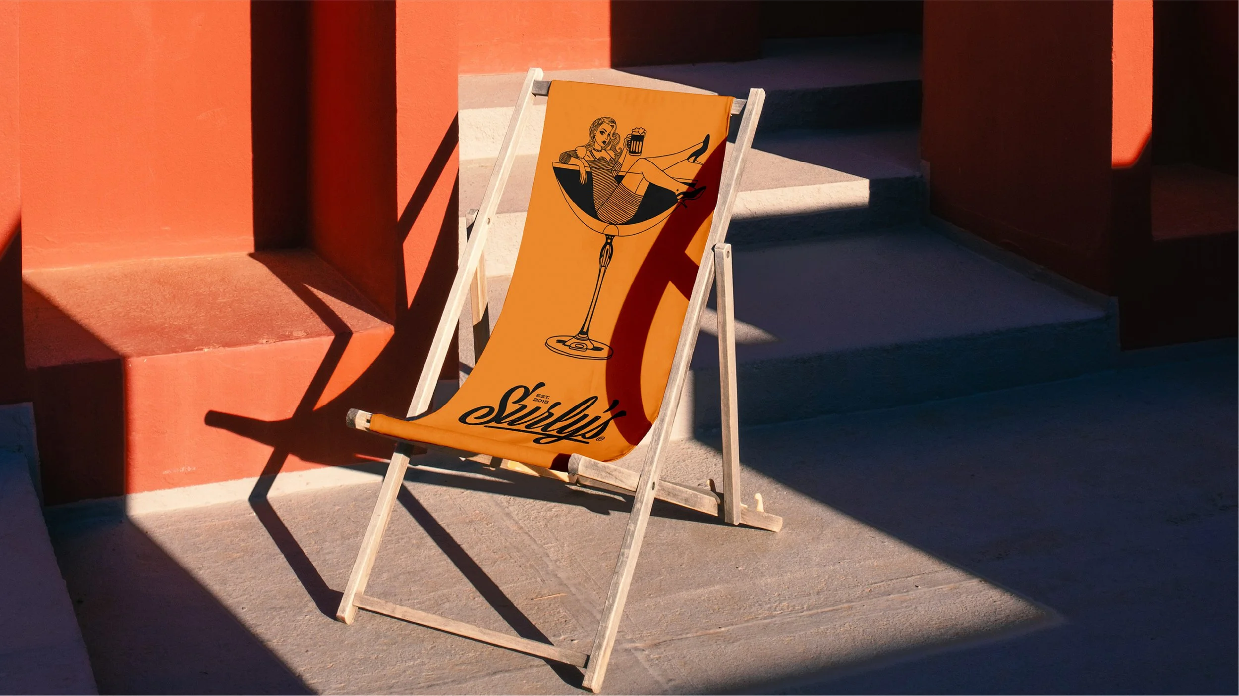
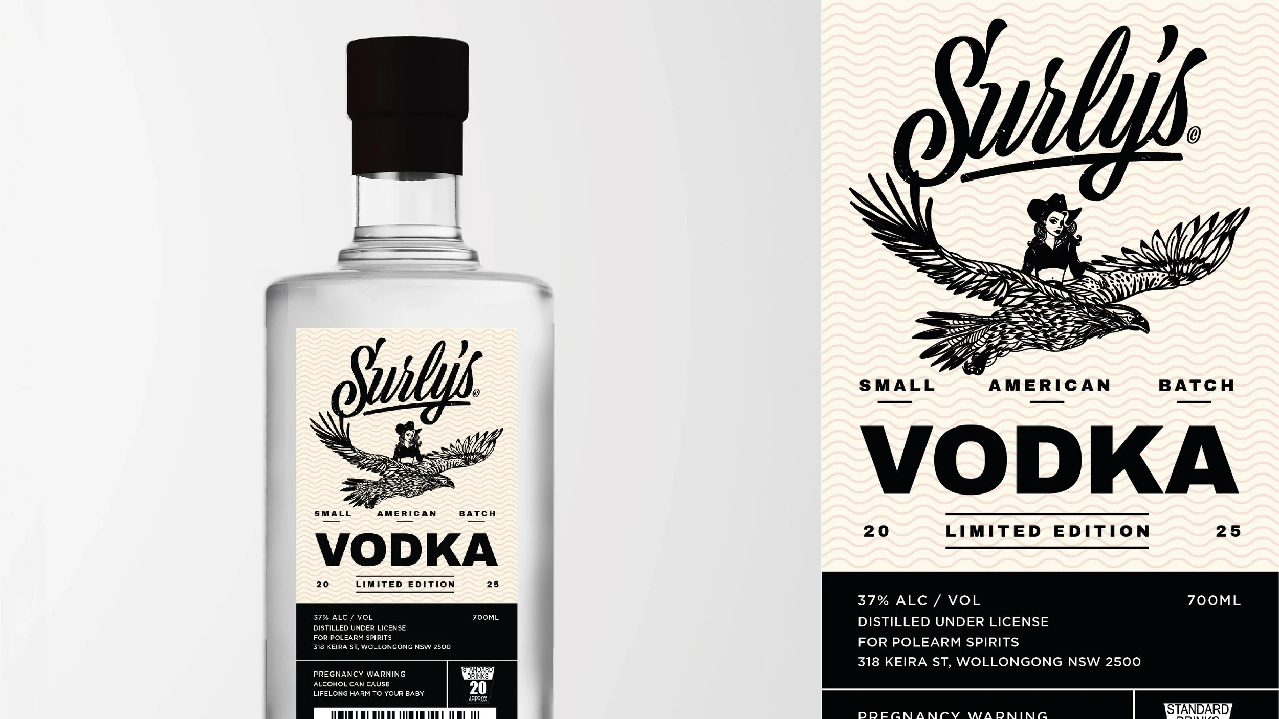
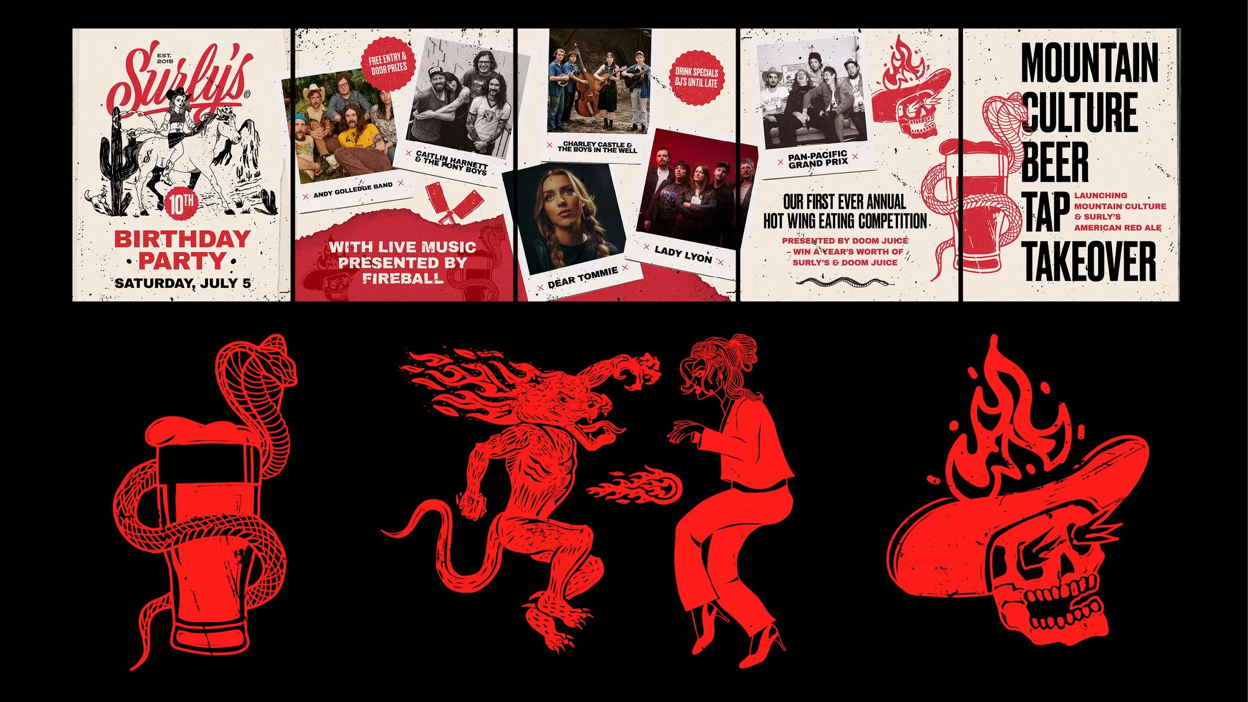
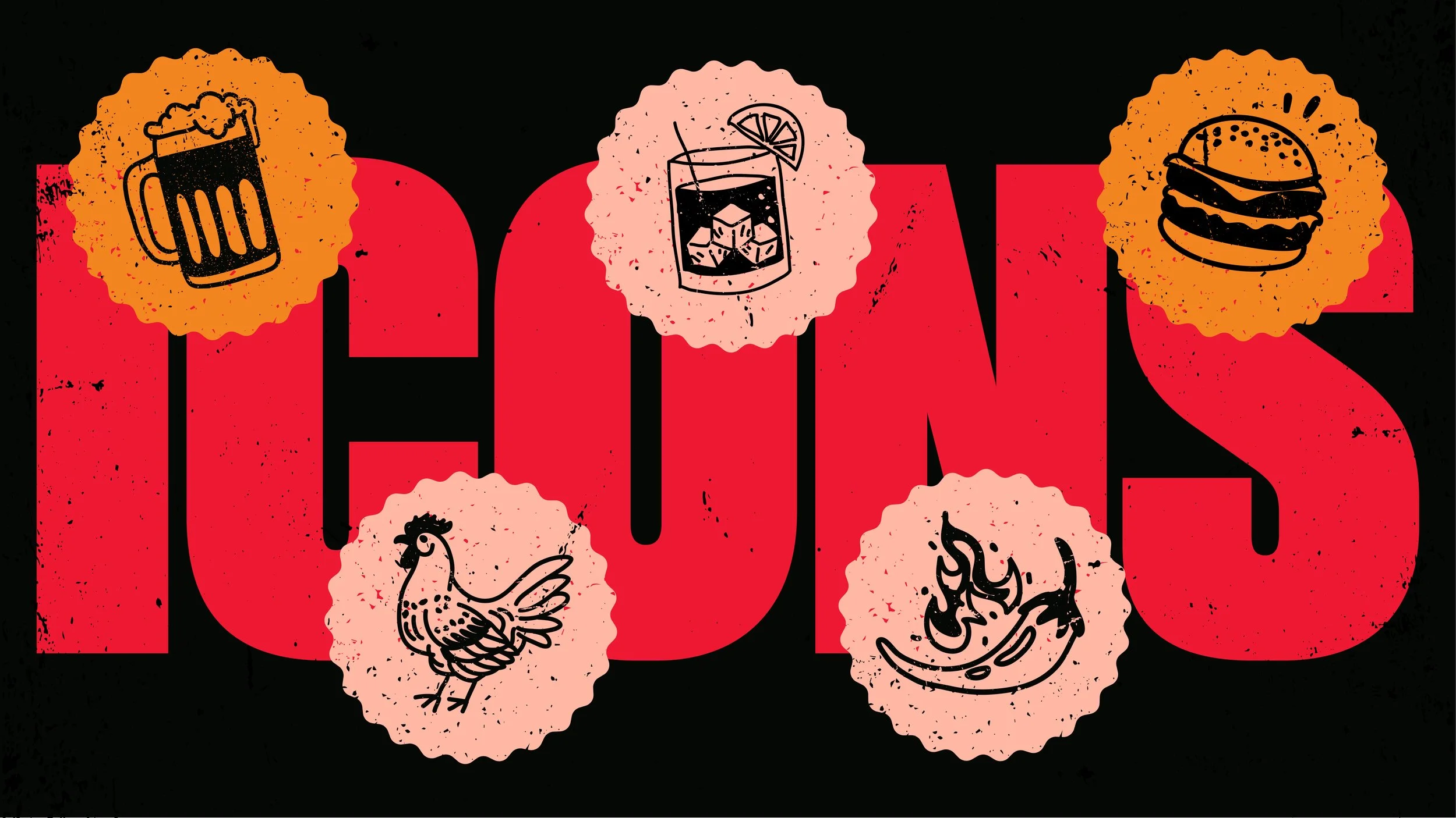
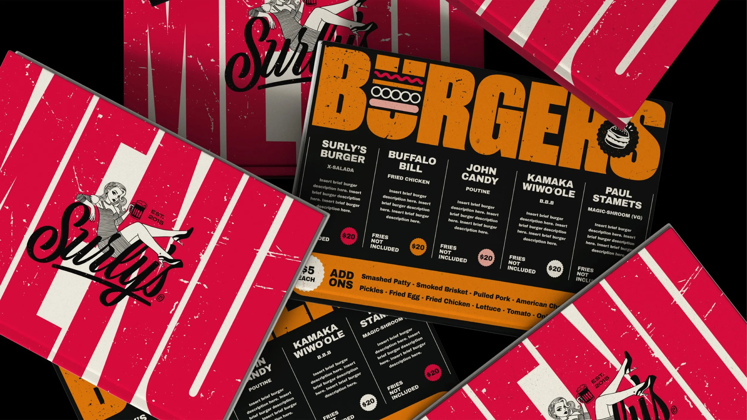
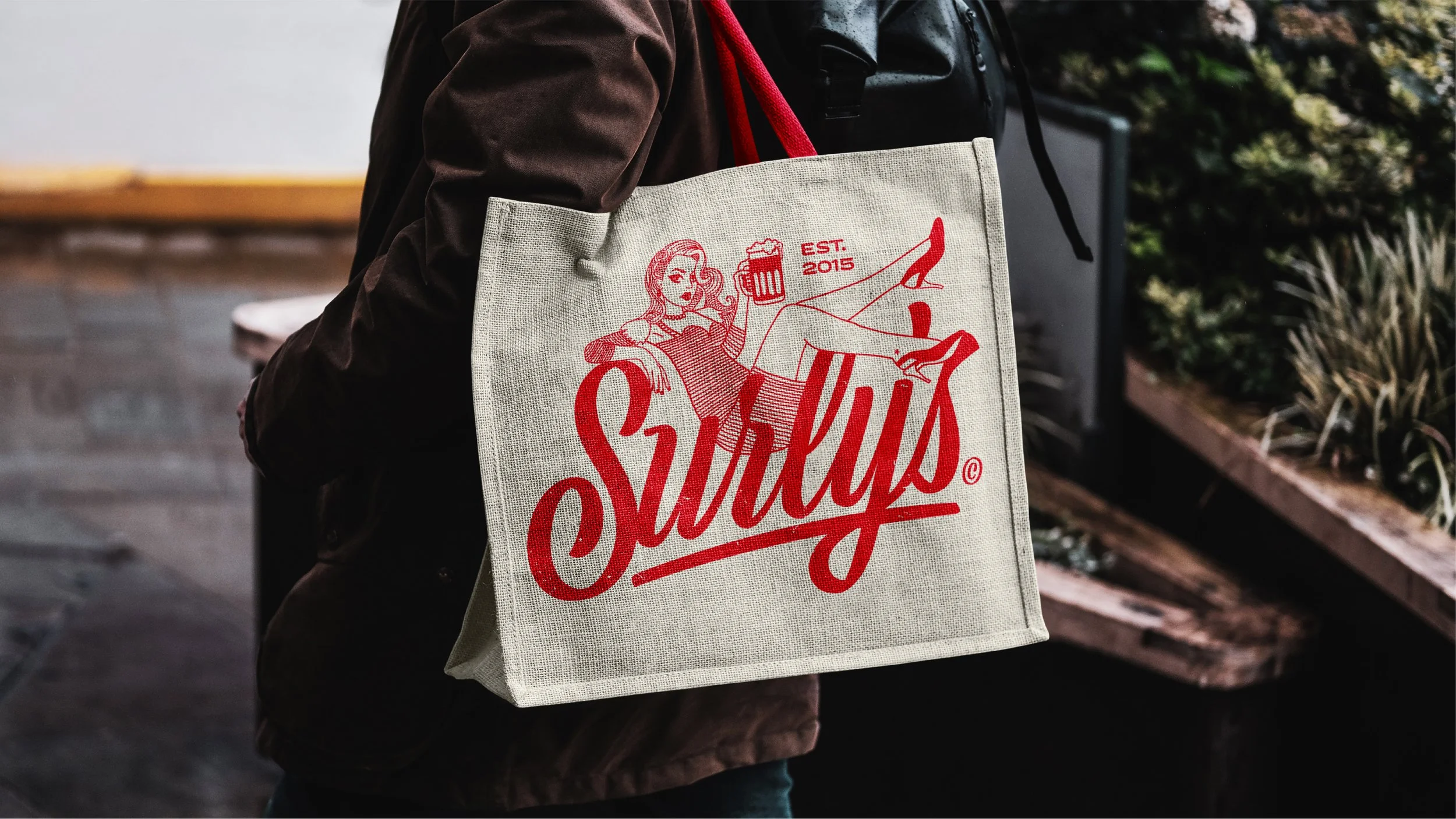
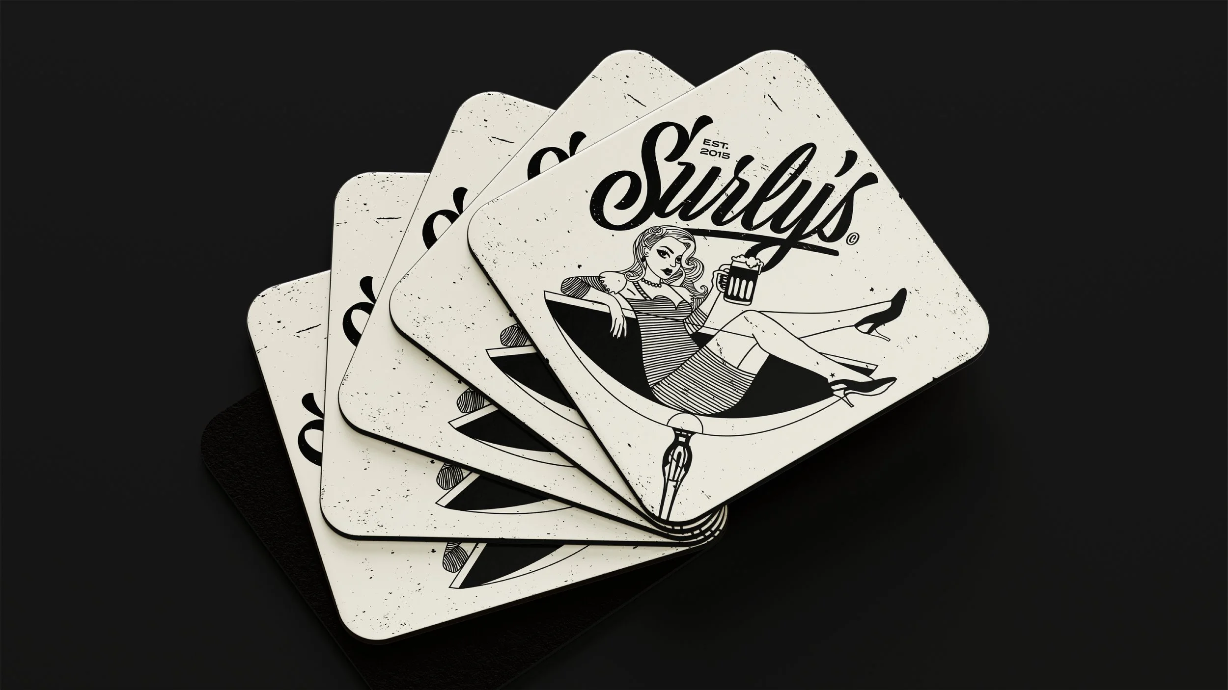
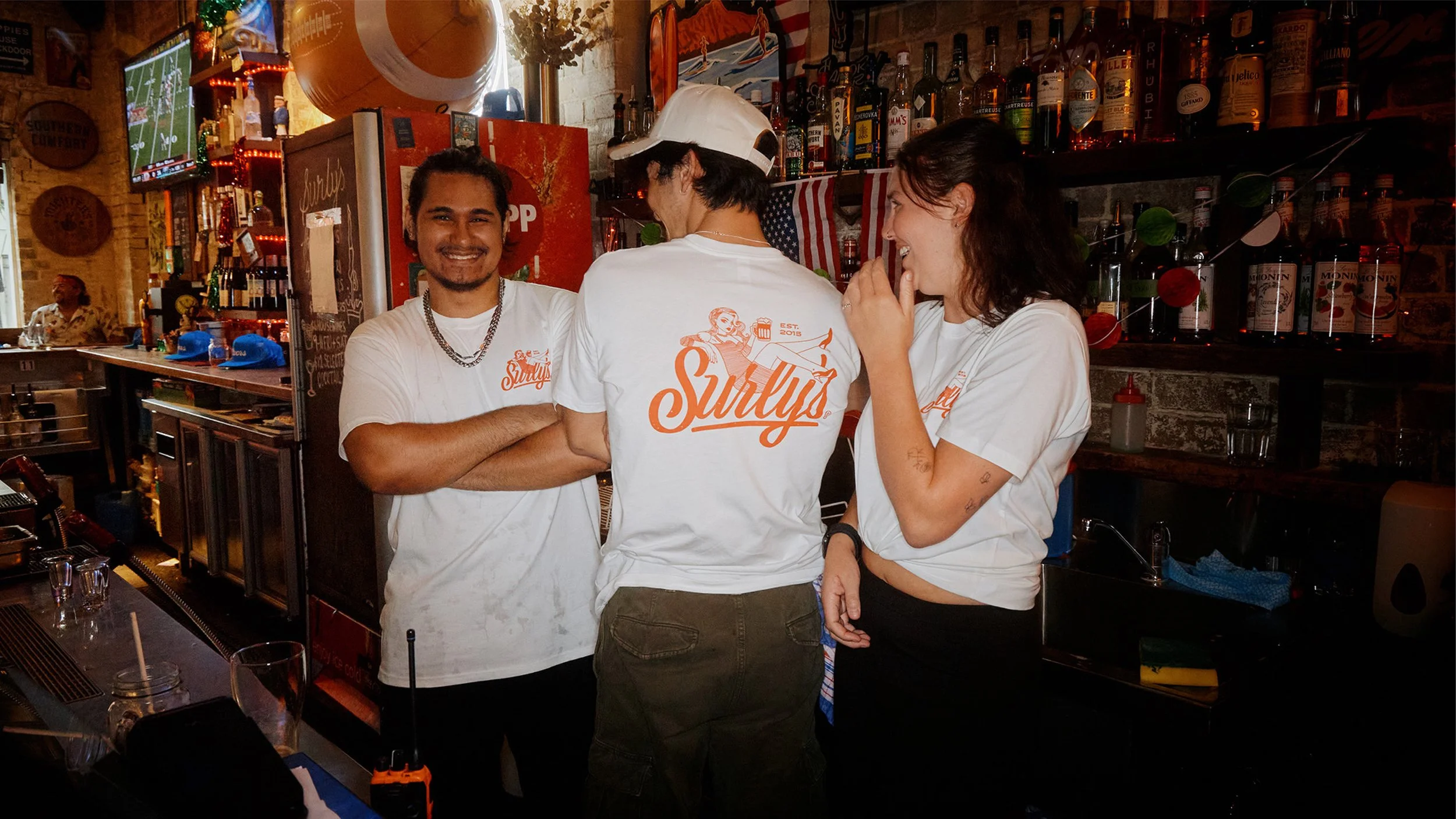
This was brought to life by introducing Surly as a physical character, and celebrating American food & drink culture through the use of bespoke signage and bold merch - focussing on their culture and the history of the name.
2025-2026
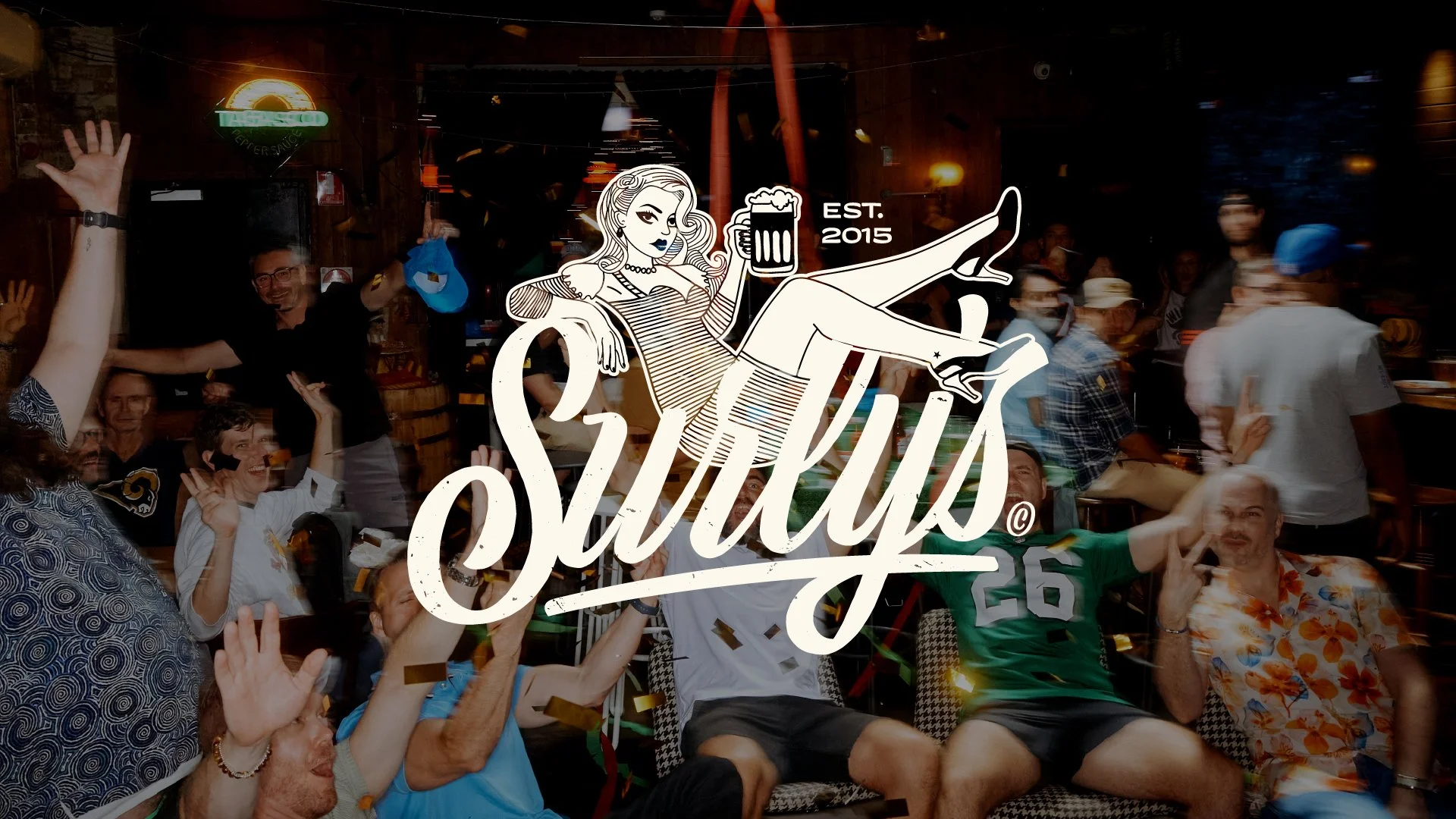
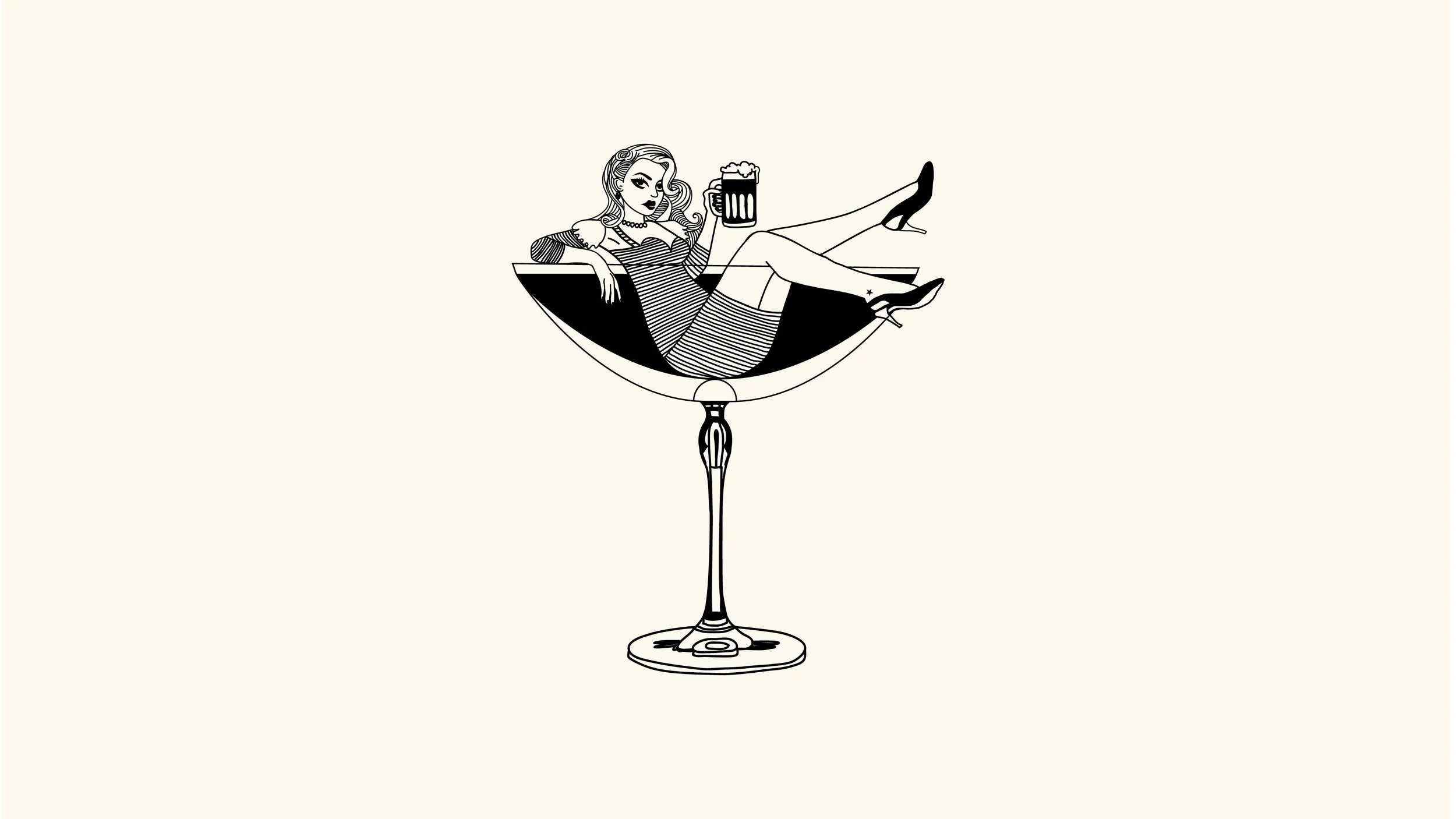
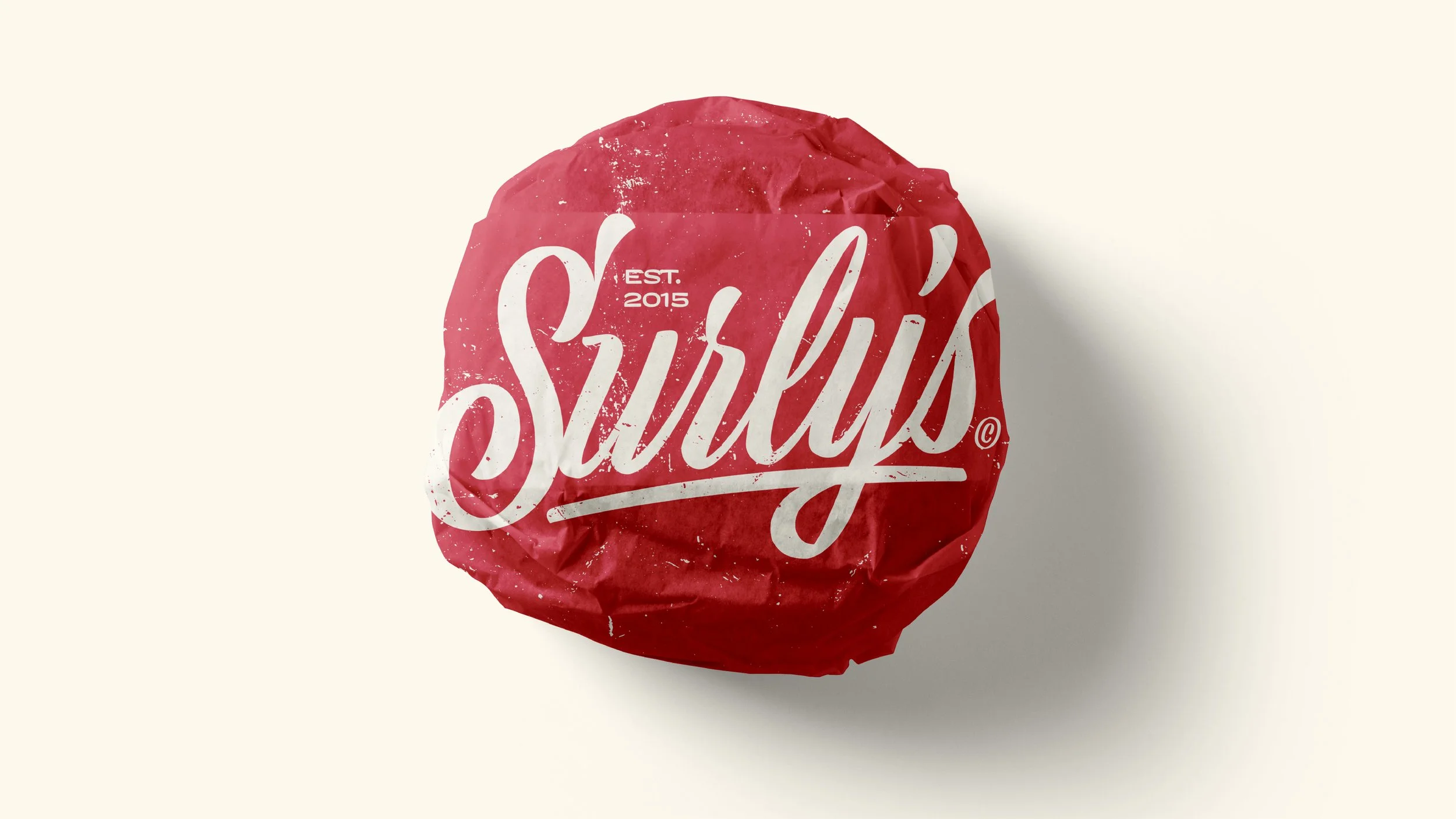
The purpose of Surly’s rebrand was to enhance, not replace their existing logo. We introduced a new script font that had a lot more depth than the current version but kept the structure so it was easily recognisable for their local customers. We dived head first into the gritty, textured interior of the bar and introduced Surly as a fictional character, giving a gentle nod to the historical influence of the surrounding area which naturally focussed on a stereotypical pin girl approach with a modern attitude.
“I COULDN’T GET ENOUGH. I EVEN TOOK OUT A LOAN SO I COULD CONTINUE TO WORK WITH THE DOG DAZE TEAM. MY WIFE HAS LEFT ME, BUT IT WAs WORTH IT.”
ANONYMOUS, 2026